How to work with a visual designer to quickly produce a logo

Moving forward in our web and mobile development tutorial series, here we'll take a break from writing code and get back to the branding and visual design aspects of our app that we'll be building step-by-step together. Specifically, we'll look at the process of coming up with a suitable logo for launch (i.e. it always changes later, so relax and trust your designer).
[Author's note: I wrote the first couple dozen tutorials in this series a few years ago and I'm in the process of updating the content to reflect the evolution of best practices in the industry. Please comment if you see anything I missed that should be updated. Thanks!]
FIRST, KNOW WHO YOU ARE (AND YOU WHO ARE NOT)
Most startups are led by the creatively challenged. The typical entrepreneur is someone who can sell an idea and/or code it up, but without a legit designer in the game the resulting product — as we all know — looks and feels clunky.
So, if you are like most entrepreneurs, find someone to bring onto your team who has branding and design skills, and trust him/her. Seriously, be humble, listen, and be a team player.
If you happen to be a creative who can pump out a logo no problem on your own, then congratulations — if you learn how to write code and have decent communication skills, your future looks bright. :)
SECOND, CHANGE AS LITTLE AS POSSIBLE OF YOUR DESIGNER'S INITIAL MOOD BOARD
As we discussed previously, give your designer tons of detail about your app, answer his/her questions about the story and desired feel of your app, and sit back and see what happens.
Here's the mood board the designer for OurAgendaApp (Tim) came up with:

He did a good job capturing the different elements of our story and desired feel (crisp, clean, modern, simple, etc…). I had a few small tweaks from the original he sent, but not much. It basically looked like this when he handed it to me.
THIRD, STAY ‘LEAN' AND DON'T WASTE YOUR DESIGNER'S TIME.
Working from the mood board and the story of your app, have your designer sketch out a few ideas and snap a photo or scan 'em over to you.
Here's what Tim came up for us in a few minutes:
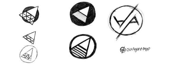
Good start. I wasn't really feelin' any of them so he went back to the drawing board and came up with:
I wrote him a quick note after looking at these:
“I think you may be on to something — but I'm not sure what you're getting at? i.e. it's not obvious…what are the dots/lines/triangles getting at….connectivity? collaboration?”
And he wrote back:
“Yeah, it's a bit more abstract, connectivity/collaboration was mostly what I was going for. I'll push it farther so it more clearly communicates those things.”
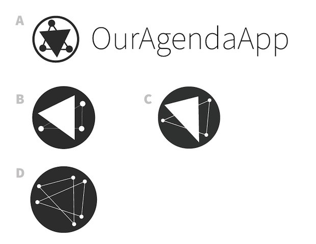
Then the next day he sent over:
Okay, here's some more rough ideas, if you can pick the one that best embodies the app/brand I can do some refined iterations. Or alternatively if none of these work I can go back to the drawing board.
I parked on these for awhile. Each mark had a unique flavor to it and I really appreciated the work Tim did on this iteration. Quick turnarounds and lots of options to choose from — even if they are rough — makes for a smooth experience.
I wrote back:
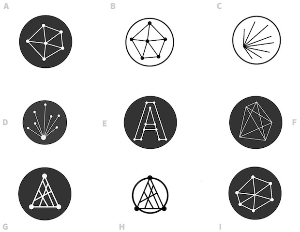
“nice — let's go with D and try a bunch of different arrangements of it — maybe try a nice symmetrical one?”
And he got back to me quickly with:
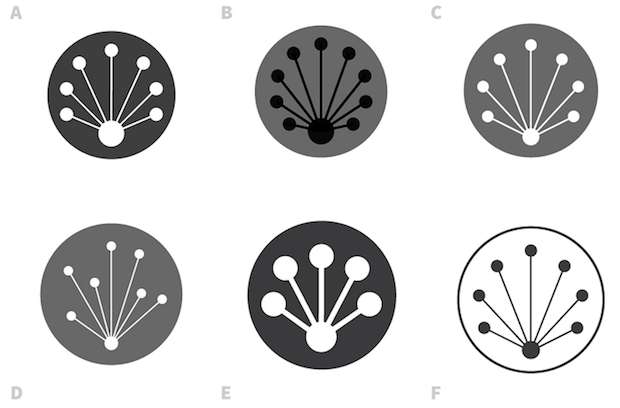
Nice. At this point I'm thinking that my sense to go with a symmetrical one was wrong, but I wanted to ride it out, so I wrote back:
“Nice — let's look at C & D with the typeface next to it and pick a winner”
And he sent back:
Awesome. At this point I'm thinking it's too early to think about color, and I thought the symmetrical one looked a bit too “flower-ish” — so I wrote back:
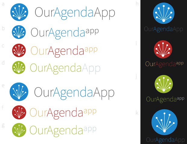
“Let's go with the (f)/(g) mark and typeface balance, but with “OurAgendaApp” as the same font size. Send it to me in black on white background real quick (i.e. no color). “
And he got back to me with:

Bingo! Good enough for now. The mark works in lots of possible colors, sizes, and mediums. I like to look at the mark as huge, and small, and think of it on a t-shirt, coffee cup, etc… AND, the designer is happy with it as well (this is important, don't make your designer move forward with something he/she isn't passionate about).
I asked Tim to write up his thoughts during the process:
“After deciding on a final moodboard, which gives us a design goal, a ‘north star' to follow while creating the brand, we start to design the logo. After reading the spec/brief to get a good understanding of what the brand will stand for and what the app will aim to do, I started to sketch a ton. My goal was to get as many ideas out of my head (both the good and the bad) as quickly as possible. Since a logos primary role is to communicate what the brand/app is about I focused on keywords like efficiency, connectivity, collaboration, and coordination (all things that the app will help achieve) while sketching.
After roughly sketching a bunch of ideas, I sent them off for approval. My first ideas were rejected (very very rarely will the first sketches you show your client/boss/etc will be chosen as the final logo) and I went back to the drawing board. I sketched some more, repeated the process, and after about three more iterations and rounds of review, we chose a logo idea that would work for the final logo. I brought the scanned sketch into Adobe Illustrator and created a vectorized version of the logo. I played around with the shape, size, and alignment of various elements, tried out various color schemes, and paired it with the typeface. In the end, we had a logo (mark + typeface) that worked in both color and black & white, and it could appear as just a mark (without the typeface) or simply as a logotype (without the mark), depending on the context in which the logo would appear.”
Awesome! At this point we're both happy with it — not over-thinking it — and friends we ran it by liked it, too.
My guiding principle along the way was to not get overly picky, but still be clear about what I liked and didn't like. Obviously, you or anyone else probably would have picked a different route through the back-and-forths, but a key part of being the lead is making decisions and moving on without getting stuck inanalysis paralysis. I and Tim both know this logo probably won't be the long-term option — but it works. Time to move forward!
- — -
In our next post in this series we'll discuss the process of coming up with a UI specifications doc for our app to guide the creation of a developer-friendly UI flow chart. With these in hand, our designer can build us out some simple wireframes. The more work we do here before getting to mockups (and certainly before writing any code), the better.
Previous post: Step-by-step “Hello World” examples in JSON, Eco, and Backbone.js