How to create a user experience flow chart (UX Flow Chart)

Next up in our web and mobile development tutorial series, here we'll examine the process of moving from a User Interface Spec to the construction of a flow chart that describes the detailed user experience (UX) through the app. This is where the engineer(s) and creative(s) must work closely together to decide what kind of software tools can best support the intended interfaces and click/swipe behavior, down to every last tab, tooltip, lightbox, icon, etc…
Author's note: check out Startup Rocket's new web app and ops framework for founders spinning up new ventures. The UX flow chart step is a critical part of the "create" stage.
Also, FYI, I wrote the first couple dozen tutorials in this series a few years ago and I'm in the process of updating the content to reflect the evolution of best practices in the industry. Please let me know if you see anything I missed that should be updated. Thanks!
FLOW CHARTING SOFTWARE
While there are plenty of flow charting tools available out there, we've found that using Google Docs' Drawing software is more than suitable for our needs because:
- It's super easy to use and free.
- The built-in collaboration tools are world-class and make comment-tracking and direct email replying to comments simple.
- The ability to link to Google Drive files (or any URL) from ‘nodes' of the flow chart facilitates real-time progress-tracking for remote teams.
While Google Drawings aren't explicitly designed for flow-charting (i.e. one drawback is that arrows to nodes don't automatically move when nodes are moved), we've found that the benefits outweigh the drawbacks.
A FLOW CHART FORMAT FRIENDLY TO UI DESIGNERS AND DEVELOPERS
Below is the simple format we use in a Google Drawing that forces the engineer(s) and creative(s) to think carefully through exactly how content (for web apps) will be presented to users, and allows everyone to click on a node to view the latest wireframe or mockup:
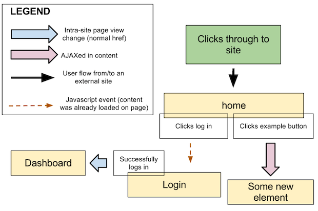
In this example, each of the arrow types represent a critical decision that developers (especially) need to speak into.
- Blue-colored arrows represent normal page-to-page transitions. These are relatively slow user experiences but are often appropriate, of course.
- Lavender-colored arrows represent Asynchronous JavaScript and XML (AJAX) transitions, which pulls content in behind-the-scenes from the server and presents it as desired into one more more elements of the UI.
- Brown-colored dashed arrows represent on-page JavaScript events such as tooltip presentations, lightbox window displays, tab switches, etc… that do not require AJAX calls (i.e. the content is already present in the browser but in most cases hidden).
What is also important to note is that yellow boxes (nodes) represent new pages or elements of the UX that, in our preferred system, always link to URLs of the current wireframe or mockup of that node.
We'll discuss specifics of wireframes and mockups later in this tutorial series, but for our purposes here we've found that linking nodes directly to URLs of images hosted on Google Drive is helpful because the collaboration tools to comment on specific parts of the image are excellent (e.g. you can draw a box around a specific element and start a discussion about it that your team can have over direct email … and Google will keep record of the conversation in the comment window for that file. It's pretty sweet.)
THE ‘OUR AGENDA APP' FLOW CHART
So, moving right along then, here is the specific example of our flow chart based on the UI Spec we created previously for the app we are building step-by-step together in this tutorial series:
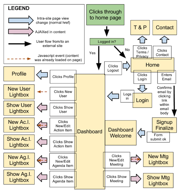
Here are the key things we had in mind while constructing this flow chart:
- We wanted to ensure every top-level component of the UI Spec was covered so we didn't miss anything.
- One of the main purposes of this flow chart is to cover every possible element/tab/icon/etc… so that our UI designer won't have to come back later and wireframe/mockup something for our minimum viable product (v0/MVP). Thus, some of these nodes can combine multiple ‘states' of the view to avoid the creation of unnecessary wireframe/mockup images.
- For example, since obviously the Dashboard is our main view, we can tell our designer to both fill in example resources in the four columns (Meetings, Users, Action Items, and Agenda Items) AND show the UI for what happens when multiple resources from different columns are selected.
- The Dashboard Welcome node is attached to the Dashboard node (i.e. it will have all the same UX components) but is separate because this view should be mocked up independently — it have an empty set of columns and need to give the new user a quick “tour” of features, which is a common and helpful feature for apps.
- From the engineering perspective, knowing that this would be a Backbone.js app using Eco templates, we had to make a decision of what front-end code would already be loaded in the browser to facilitate JavaScript and/or AJAX transitions in the UX. This led us to place the blue, lavender, and/or brown-dashed arrows as appropriate so we knew more specifically how we would build out the app later. It is helpful to make these decisions as early as possible.
- The overlapping JavaScript and AJAX arrows in this flow chart are simply a shorthand way to note that the “new” views will be simple JavaScript events, and the “edit” views will require an AJAX call. These don't require separate wireframes/mockups.
- The standard Terms and Privacy pages for a web app — noted above as the single node “T & P” — will be a generic page layout that we can use down the line for multiple one-off pages as needed.
- And finally, it is important not to introduce extra features here beyond what we wrote down in the UI Spec. New ideas will inevitably come in this stage as you build out the flow chart, but you should note them for a future release. Now is the time to focus on building the v0, launching it ASAP, and testing how users interact with it so you can begin making data-driven decisions about new features.
If you are reading this and prepping to build out your own UX flow chart, note carefully how we did both the “Logged in?” conditional and the “Dashboard Welcome -> Dashboard transition.” These types of relatively-complex scenarios can be visually explained different ways, but the key idea is that all your nodes cover everything your UI designer needs to wireframe/mockup and that he/she understands exactly what's expected. As long as your team is on the same page, then you are good to go.
- — -
In our next post in this series we'll begin by building out the wireframes for each of our nodes (Yellow Boxes) in our UX flow chart. Previous post: How to create a user interface specifications document (UI Spec).